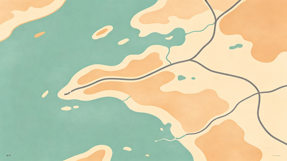
Soft Land Shapes vs Realistic Maps
Poster maps and navigation maps have different jobs. Navigation maximizes data; posters maximize clarity and mood. That’s why soft land shapes usually win on walls.
Design either approach in MAPDRAW.APP.
What “soft land” means
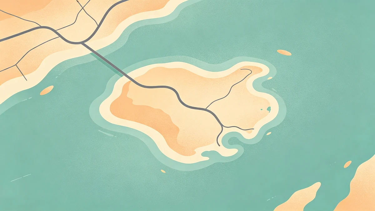
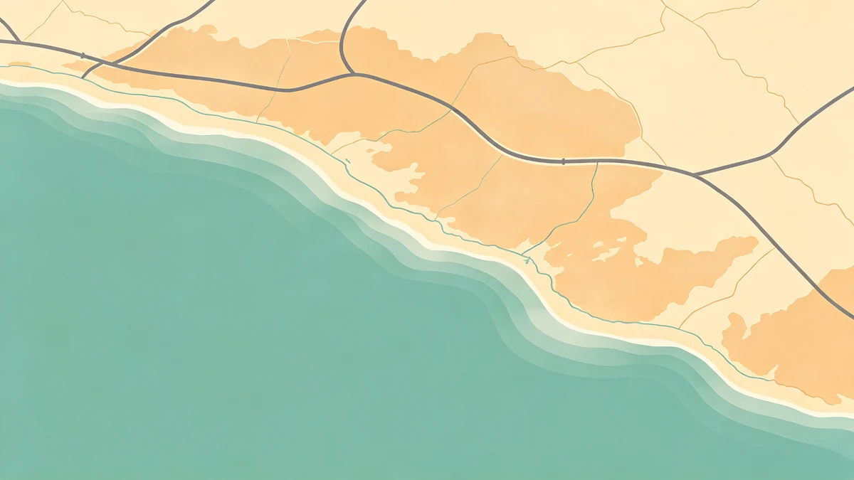
Simplified coastlines, calmed inland edges, fewer microscopic notches, intentional exaggeration of recognizable silhouettes. Related: coastal shoreline styling.
When soft wins
- Gift art (wedding, anniversary, graduation)
- Home décor (ideas)
- Minimal / editorial looks (minimal, dark)
- Route heroes where basemap must stay quiet (road trip, hiking)
When more realism helps
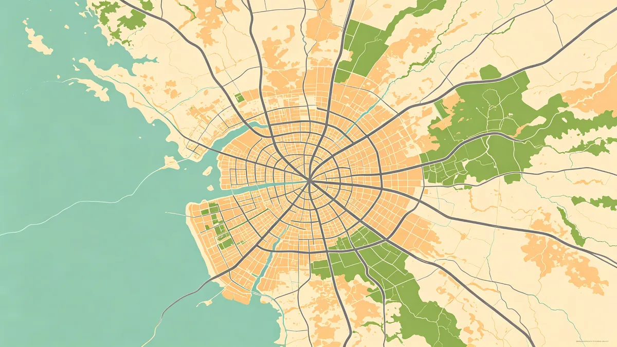
- Fans who know every pier and pier cut
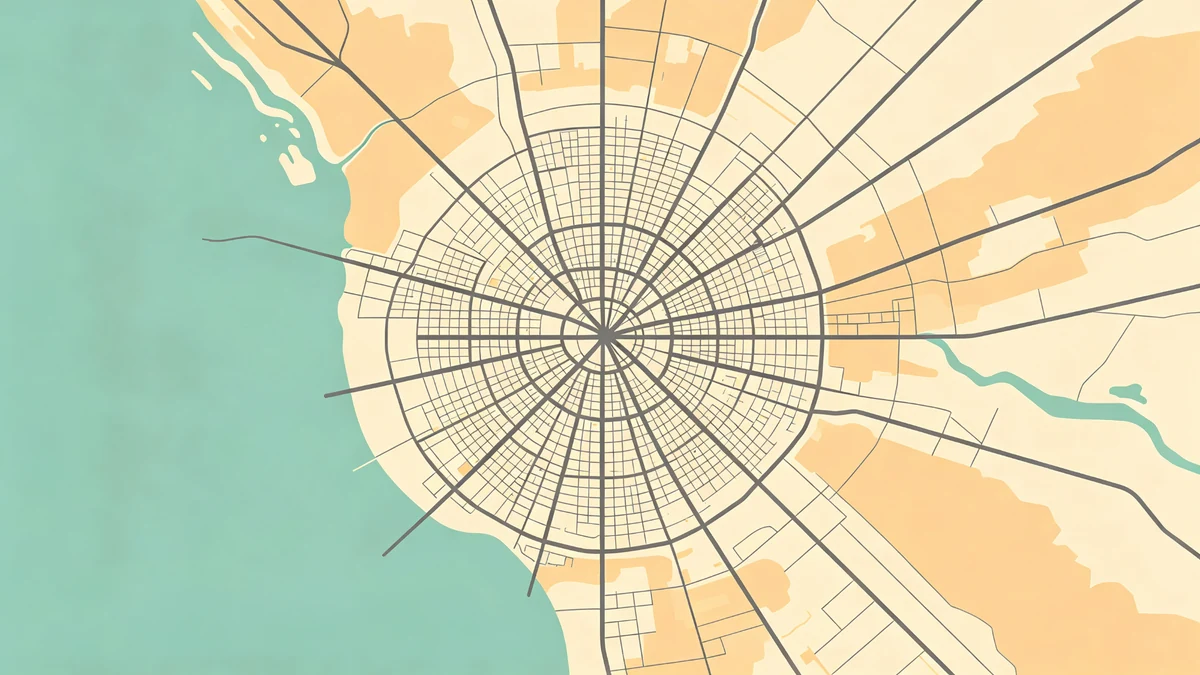
- Dense downtown identity where grid texture is the charm
- Some office/client maps that need instant recognition
Even then, simplify labels (label guide) and icons (icons).
Depth without noise
Soft shapes + subtle shadows often beat hyper-detailed terrain fills. Color roles: choosing colors.
Practical workflow
- Start realistic enough to recognize
- Soften edges until the silhouette reads at a glance (beginners)
- Re-introduce only structure that supports the story
- Export for print (export settings)
Full build context: custom map online and checklist.
FAQ
Is soft the same as inaccurate?
It’s editorial accuracy—recognize the place, omit noise.
Can I mix soft land with detailed roads?
Yes; keep road weight hierarchy so the poster doesn’t gray-out.
Travel collage maps?
Soft lands keep multi-stop layouts readable—see family multi-trip and travel footprints.
Keep exploring on MAPDRAW.APP
Ready to design? Open the map editor, browse templates, or check pricing.