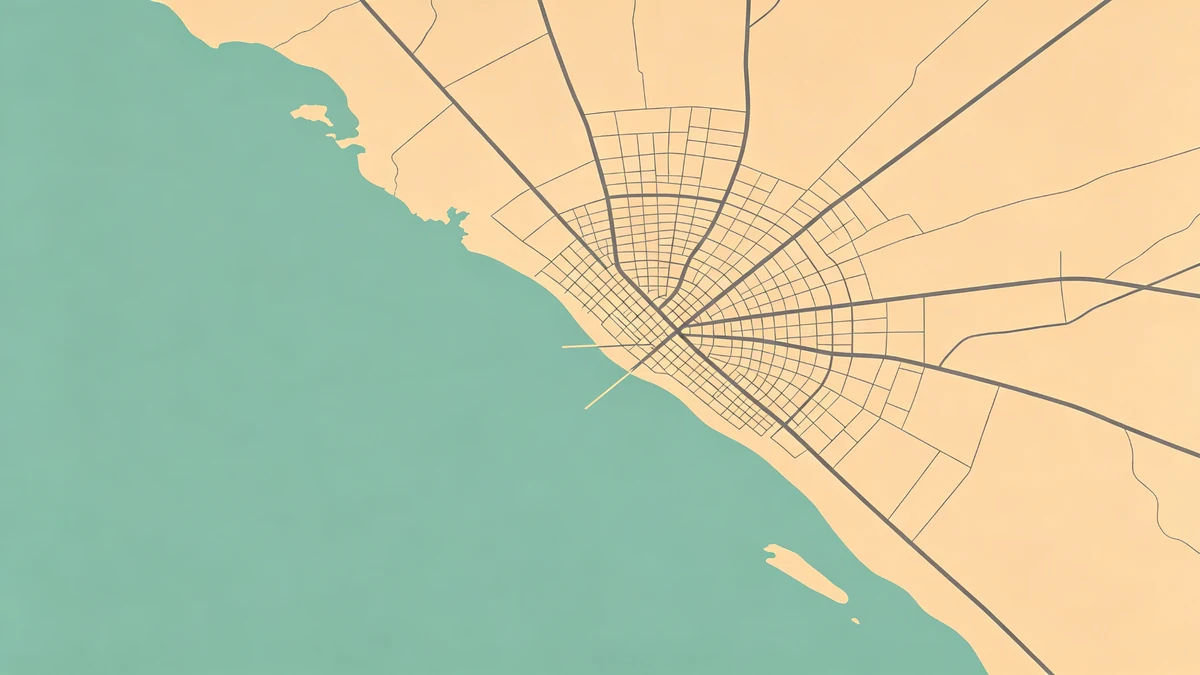
Minimal Map Poster Style Guide
Minimal map posters look expensive when contrast and spacing are disciplined—and cheap when dense black streets turn into toner noise. Build the look in MAPDRAW.APP.
Why minimal works
Matches furniture, photographs cleanly, forces better hierarchy. Pair with label restraint and icon restraint.
Value recipes
Light mode
Bone/cream paper, pale land, mid water, charcoal roads, black title.
Dark mode
Charcoal field, light roads, white title—see also dark posters.
Pure #000 on #FFF with maximum street density rarely equals “gallery.”
Simplify first
Monochrome exposes clutter. Soften geometry (soft land shapes), crop tighter (beginners), and let water silhouettes speak (coastal).
Typography
One family, strong size jumps, avoid hairlines that vanish in print (export settings, sizes).
Where minimal shines
Apartments (décor ideas), modern weddings (venue maps, offices, boutique stays. Add one accent only if intentional (colors).
Depth
Prefer subtle shadows or none. Heavy shadows break minimal calm.
Project ideas
City sets with identical chrome; anniversary coordinates (anniversary); quiet basemaps under road trip routes.
FAQ
White roads or black roads?
Both work—pick one system and stay consistent across a series.
Can minimal include color?
Yes: one accent for water or title. More accents stop being minimal.
Matte or glossy?
Matte suits minimal maps and reduces glare.
Keep exploring on MAPDRAW.APP
Ready to design? Open the map editor, browse templates, or check pricing.