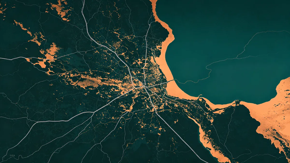
Dark Map Posters: When They Work (and When They Don’t)
Dark map posters can look editorial and premium—or like a crushed screenshot. The difference is contrast discipline and room context.
Try them in MAPDRAW.APP.
When dark works
- Dim living rooms and theaters
- Modern offices with controlled lighting
- Moody coastal night palettes (coastal
- Pairing with light frames and mats
Also strong as a twin to minimal light maps in a diptych.
When dark fails
- Already-dark bedrooms with no lamps
- Low-contrast gray-on-gray roads
- Glossy paper under spotlights (glare)
- Tiny thin type
Craft recipe
- Separate values: land, water, roads must differ
- Light roads on dark land or dark roads on lighter charcoal fields—commit
- Titles in true light tones (labeling mindset
- Soften geometry (soft lands; optional subtle shadows
- Soft-proof—blacks crush in print (export
Colors still matter: color guide.
Story fits
Evening anniversary pieces (anniversary, sleek weddings (wedding, route posters with glowing paths (road trip, gaming/fan caves—still avoid trademark marks.
FAQ
Pure black background?
Slightly lifted charcoal often prints with more depth than #000 voids.
Kids’ rooms?
Usually prefer softer light maps—see décor ideas.
Webcam offices?
Test on camera; crushed blacks lose street detail.
Keep exploring on MAPDRAW.APP
Ready to design? Open the map editor, browse templates, or check pricing.