How to Choose Colors for Illustrated Maps
Color decides whether a map feels like a keepsake or a screen capture. In MAPDRAW.APP, assign roles before picking pretty hex codes.
The five color roles
- Paper / background
- Water
- Land
- Roads / linework
- Typography / accents
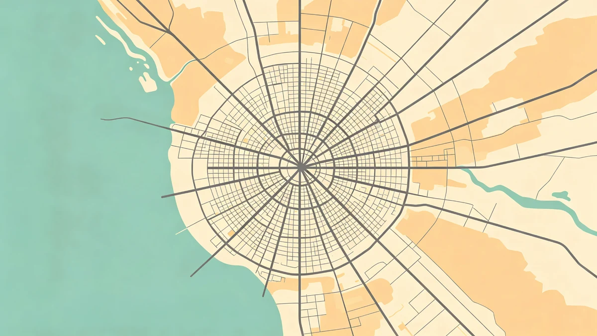
If land and roads share the same value, detail dies at sofa distance. Fix values before hues.
Palette recipes
Soft coastal
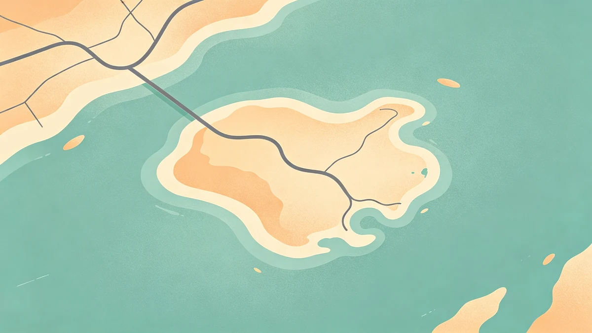
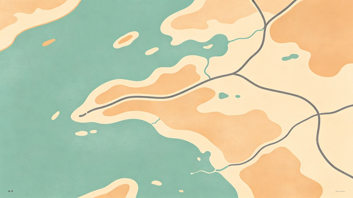
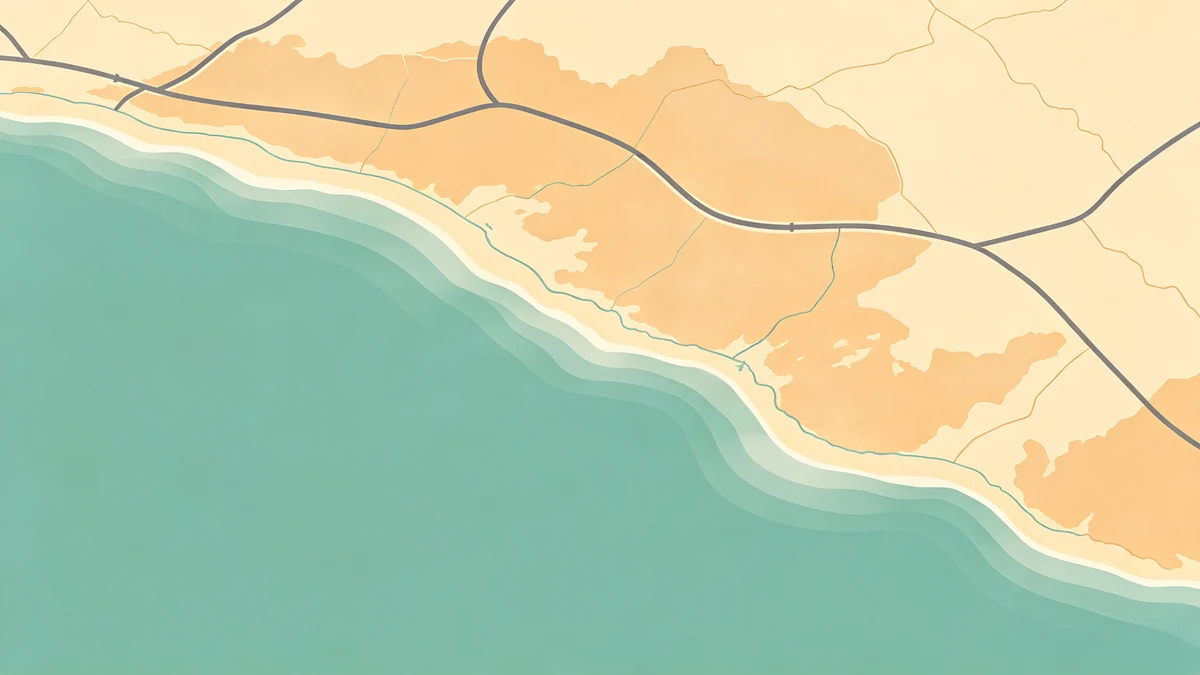
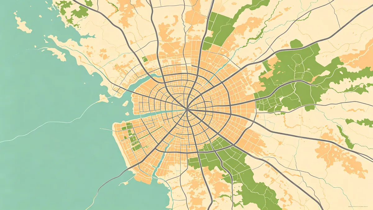
Cream paper, muted aqua water, sandy land, charcoal roads—deep dive in coastal styling.
Forest & stone
Sage land, blue-gray water, espresso lines—great with soft land shapes.
Ink & bone
Near-mono; see minimal style.
Night editorial
Charcoal fields, light roads—when dark posters work.
Gift / wedding soft
Dusty neutrals matching suites (wedding maps, anniversary).
Testing like a designer
- Check a grayscale mental pass—hierarchy still clear?
- View on phone and laptop
- Cheap proof print before bulk gifts (export settings)
- Remember screens oversaturate blues/greens
Pairing color with other craft
- Labels: without clutter
- Icons: restraint guide
- Depth: shadows
- Composition: beginners, custom online guide
Route posters (road trip, hiking) should keep basemap quieter than the path accent.
FAQ
How many colors total?
Three to five including paper is plenty for most posters.
Match brand or invitation Pantone?
Match closely, then adjust for print reality—not only screen hex equality.
No water in my city?
Create depth with land value shifts, paper tone, or subtle shadows.
Keep exploring on MAPDRAW.APP
Ready to design? Open the map editor, browse templates, or check pricing.