Hiking Trail Map Poster: Style Your Route Like Wall Art
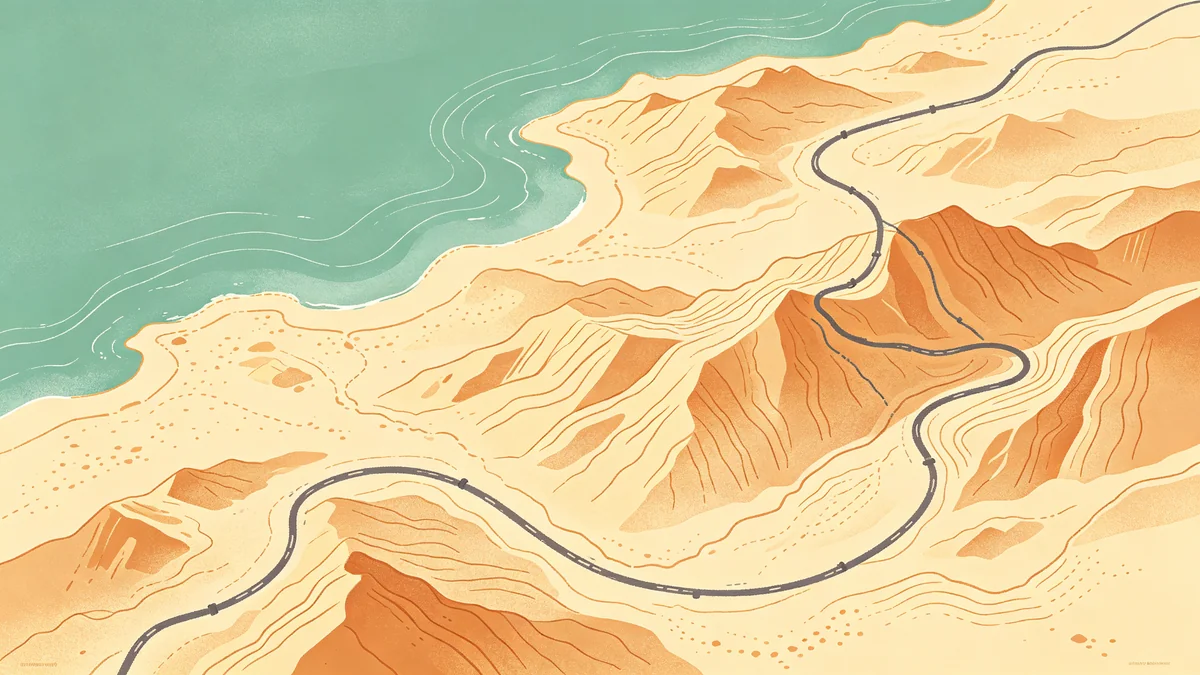
A hiking trail map poster should feel like a finishers’ keepsake: the path is the hero, the terrain is atmosphere, and stats stay secondary.
Create it in MAPDRAW.APP. For driving trips, see the road trip tutorial; for many trips over years, see travel footprints.
Hierarchy for trail art
- Quiet basemap (soften roads that aren’t the hike)
- Clear trail stroke readable across the room
- Start/finish marks small but definite
- Title: trail name + year + distance/elevation optional
Basemap philosophy: soft land shapes, optional shadows for depth, coastal/water care when lakes/ocean appear.
Color that still matches home décor
Outdoor photos are neon; wall art shouldn’t be. Use color guidance or minimal linework. Dark cabins can use dark posters if contrast holds.
Icons & labels
Contour-like clutter kills posters. Prefer sparse labels (label guide) and minimal symbols (icons) for trailhead/summit only.
Steps
- Gather route reference (official map, GPS screenshot—you’ll simplify)
- Frame so the trail has margin (sizes)
- Style land/water calmly (beginners)
- Emphasize the path; clean ugly GPS jitter into a confident line
- Title + export (print settings)
Gift angles
Summit proposals (anniversary framing), graduation adventure routes (graduation gifts), family trek collages (multi-trip layouts).
FAQ
Should I trace GPS exactly?
Usually no—simplify into a clean illustrative line for wall distance.
Multiple loops on one poster?
Possible with consistent stroke language, or make a matching series instead.
Include elevation profile?
Optional as a small side graphic; don’t let it fight the map.
Keep exploring on MAPDRAW.APP
Ready to design? Open the map editor, browse templates, or check pricing.