How to Add Icons and Stickers to Map Designs
Icons make maps personal—and they’re the fastest way to ruin a clean poster. Use them like seasoning in MAPDRAW.APP.
The one-job rule
Each icon must earn its place: home, venue, trailhead, “first coffee.” If it doesn’t support the title’s story, delete it.
Sizing & contrast
Icons should be readable from hanging distance but never larger than major type. Match stroke language to your roads. Soft maps (soft land shapes) need softer icons; minimal posters need fewer, sharper marks.
Placement
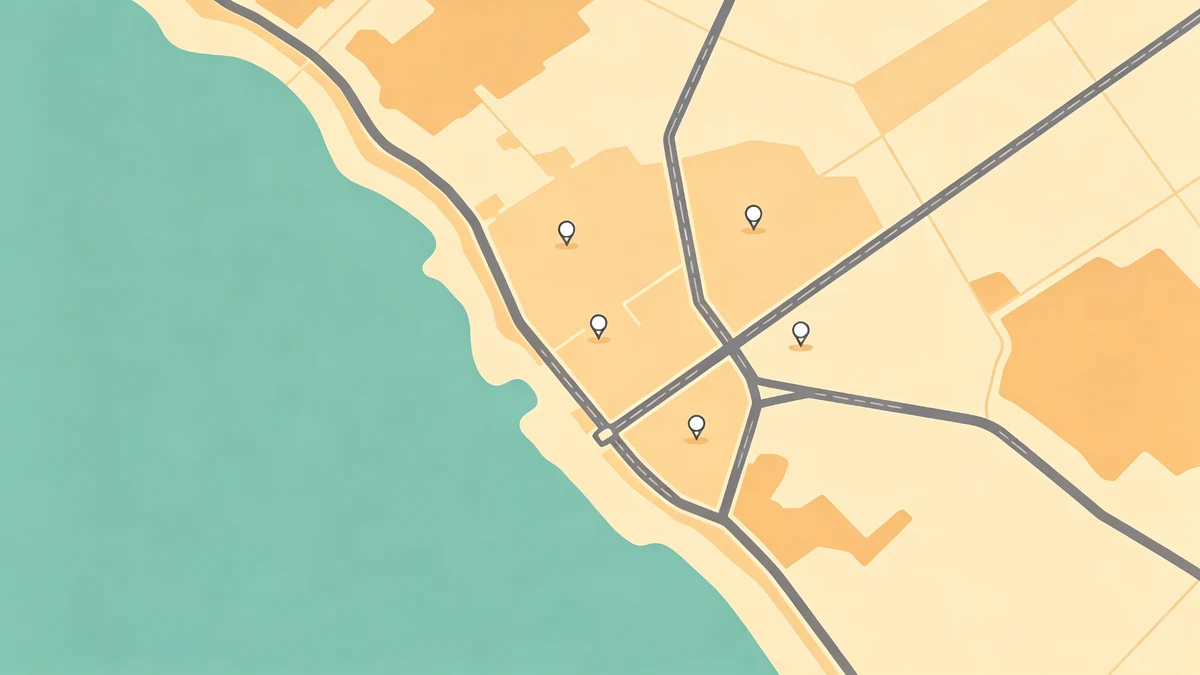
- Prefer quiet land, not dense downtown knots
- Offset slightly if the exact point collides with linework
- Keep a consistent offset language across a set
Labels nearby? Follow labeling without clutter.
Style consistency
One icon family per poster. Mixing clip-art styles reads amateur. Color accents should come from your palette plan.
Use-cases
- Wedding venue pin (wedding maps)
- Anniversary “where we met” mark (anniversary)
- Trailheads (hiking) / trip stops (road trip, family trips)
- Travel footprint highlights (travel guide)
When to skip icons entirely
City silhouette art, strict minimal / dark editorial posters, and many office pieces look stronger with typography alone (custom online guide).
FAQ
How many icons is too many?
If you need a legend, you’re probably over the line for wall art.
Photo stickers?
Rarely—they fight illustrated maps. Prefer abstract marks.
Animated/3D badges?
Avoid for print posters; keep flat, intentional shapes.
Keep exploring on MAPDRAW.APP
Ready to design? Open the map editor, browse templates, or check pricing.