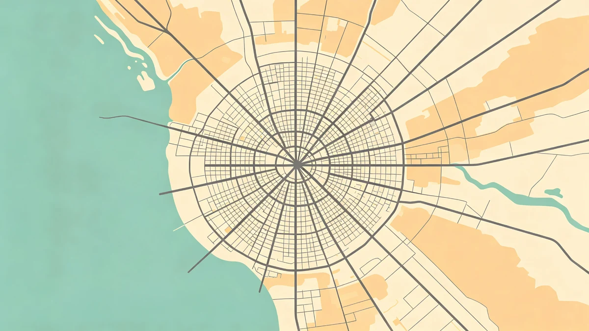
City Map Illustration Design Tips for Beginners
Illustrated city maps succeed when they feel intentional—not when they include every alley. This beginner guide focuses on hierarchy, simplification, and finishing craft inside MAPDRAW.APP.
For a full end-to-end build, pair this with how to make a custom map poster online and the workflow checklist.
Principle 1: Decide the story first
Hometown? Honeymoon city? First apartment block? The crop and detail level follow the story. Gift stories: wedding, anniversary, graduation.
Principle 2: Simplify geometry
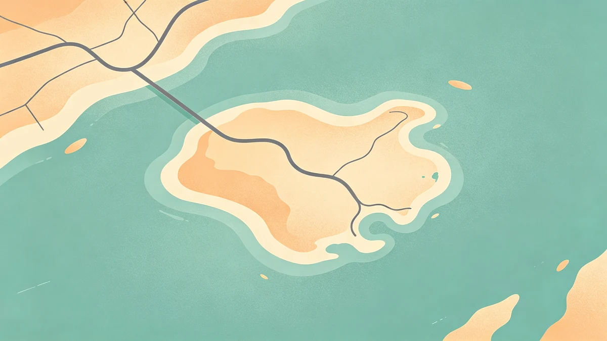
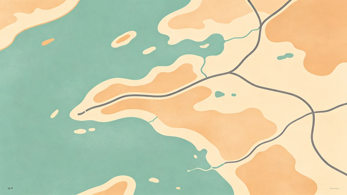
Prefer soft land shapes over noisy realism. Remove visual “static” until water, land, and major structure read instantly.
Principle 3: Build value hierarchy
Even before hue, fix light/dark relationships. Roads should not vanish into land. Water should sit calmly. Then apply color choices or go minimal / dark.
Principle 4: Lines have jobs
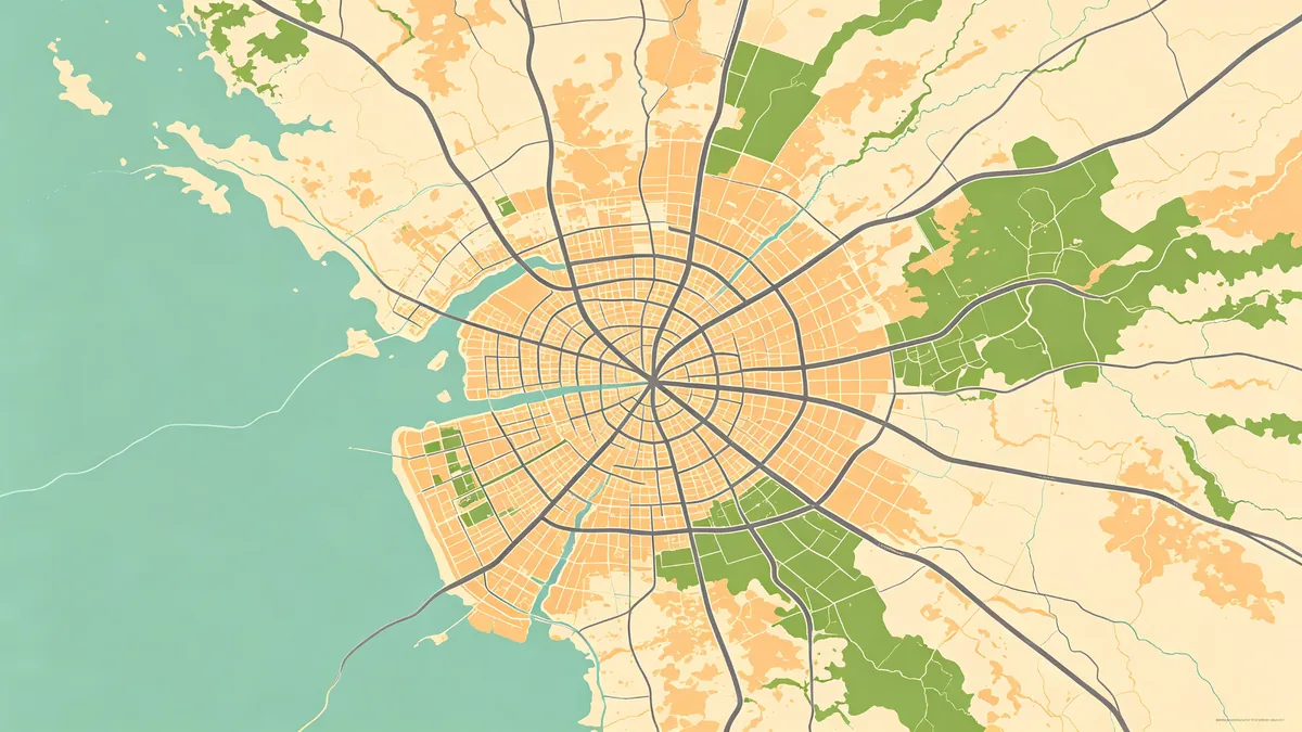
Arterials vs local streets vs decorative texture—don’t give every road equal weight. Route posters (road trip, hiking) need the path louder than the basemap.
Principle 5: Labels are expensive
Each label costs attention. Follow labeling without clutter. Often art prints need a title outside the map more than street names inside it.
Principle 6: Icons are seasoning
Read icons & stickers. One pin for “our café” is charming; twelve pins become a legend nobody reads.
Principle 7: Depth is optional
Subtle land shadows can lift shapes; heavy shadows make posters look muddy fast.
Principle 8: Design for the wall, not the zoom
Step back. If it only works at 400% zoom, it fails as décor (home décor ideas). Check sizes and export settings before printing.
Coastal special case
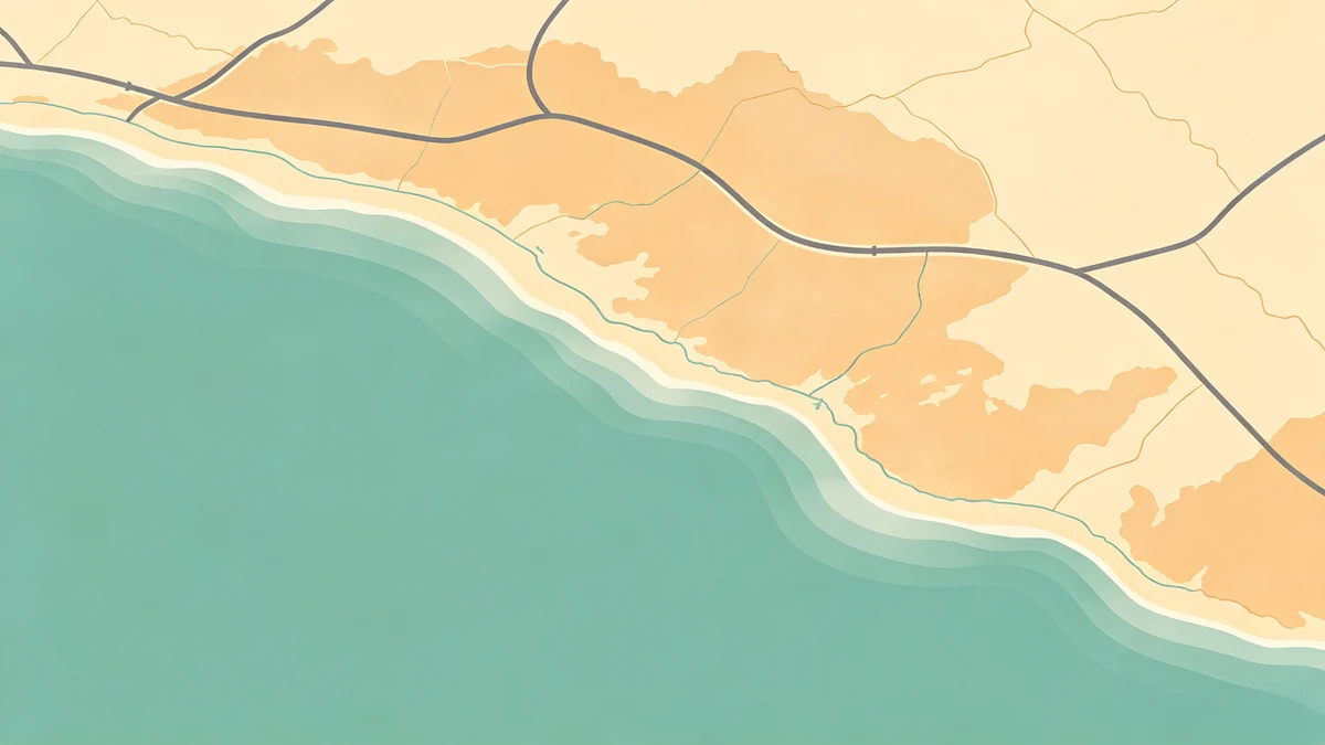
Shorelines carry recognition—see coastal styling.
Practice assignment (60 minutes)
- Pick one city memory
- Crop tightly
- Style water/land/roads only
- Add a title—no icons yet
- Export a proof
Then iterate. That’s how beginners improve faster than chasing every feature.
FAQ
Should beginners start from templates?
Yes. Templates teach structure; customization teaches taste. Browse the templates gallery.
How realistic should streets be?
Recognizable beats accurate. Soften and omit until the poster breathes.
What’s the most common beginner mistake?
Too much detail + too many labels + weak margins.
Keep exploring on MAPDRAW.APP
Ready to design? Open the map editor, browse templates, or check pricing.