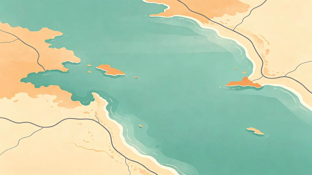
Coastal Map Posters: Water and Shoreline Styling
Coastal maps sell recognition through water. A calm shoreline silhouette can identify a place faster than fifty street labels.
Design coastal pieces in MAPDRAW.APP.
Make water the quiet hero
Water should feel like a field, not a texture explosion. Land sits against it with clear value separation (color roles). Soft edges usually beat jagged over-detail (soft land shapes).
Shoreline craft
- Emphasize characteristic bays and peninsulas
- Simplify harbor spaghetti unless that harbor is the story
- Keep labels off the busiest waterline (labeling)
Palette directions
Sand + seafoam + charcoal; navy + cream; storm gray minimal (minimal); dusk dark posters for evening rooms (décor).
Depth
A light land shadow can lift islands—don’t double-shadow everything.
Story overlays
Ferry routes and coastal highways: treat like road trip paths. Beach town weddings: venue maps. Vacation collages: travel footprints / family trips.
Print note
Blues print darker—bias lighter on screen and soft-proof (export settings, sizes).
FAQ
Inland cities with rivers only?
Same rules at smaller scale—rivers become structure, not decoration noise.
Wave patterns / hatch fills?
Use sparingly; large hatches can moiré in print.
Icons on piers?
One landmark max—see icons guide.
Keep exploring on MAPDRAW.APP
Ready to design? Open the map editor, browse templates, or check pricing.