How to Use Shadows for Depth on Map Land
Shadows can lift islands and continents off the paper—or turn a poster into fog. Use them deliberately in MAPDRAW.APP.
What shadows are for
Separation between land and water/paper, gentle stacking when shapes overlap, a touch of craft-store premium. They are not a substitute for clear color values.
Settings mindset
- Blur: soft enough to feel printed, not smeared
- Opacity: lower than your instinct
- Angle: consistent across the whole poster
- Color: neutral dark, not neon
With soft illustrated lands
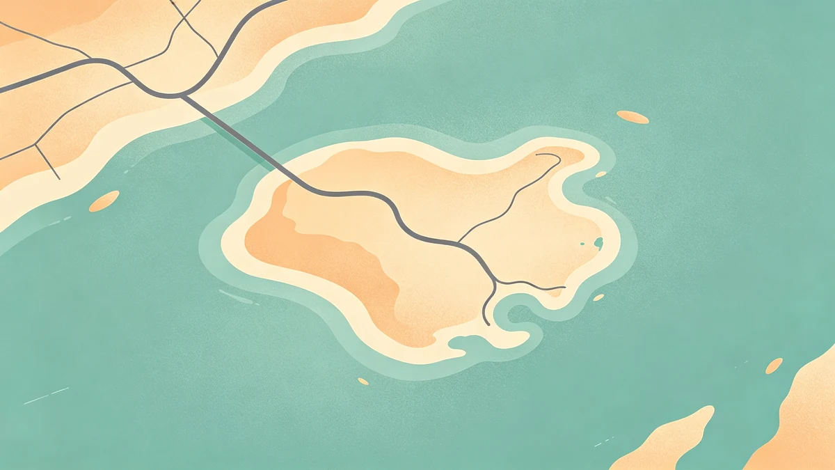
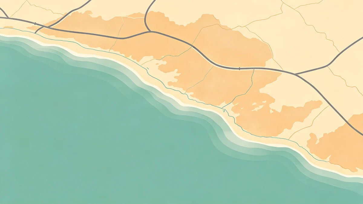
Shadows love soft land shapes and [coastal silhouettes](/blog/coastal-map-poster-water-shoreline-styling. Ultra-noisy realistic edges + heavy shadows = mud.
Style pairings
- Minimal: tiny shadow or none (minimal guide
- Dark posters: watch crush (dark maps
- Gift maps: subtle depth feels tactile ([wedding](/blog/how-to-design-wedding-venue-map-poster, anniversary
Common mistakes
Double shadows, colored glows, shadows on every road, ignoring print (export.
Workflow tip
Style water/land/roads first ([beginners](/blog/city-map-illustration-design-tips-beginners, custom online. Add shadow last. Toggle it off—if the poster dies, fix hierarchy before leaning on effects.
FAQ
Inner shadows?
Many canvas tools lack true inner shadow; simulate carefully or skip—clarity first.
Shadows on routes?
Usually unnecessary; make the stroke clearer instead (road trip / hiking).
Series consistency?
Lock angle and opacity across all prints in a gallery set (checklist).
Keep exploring on MAPDRAW.APP
Ready to design? Open the map editor, browse templates, or check pricing.