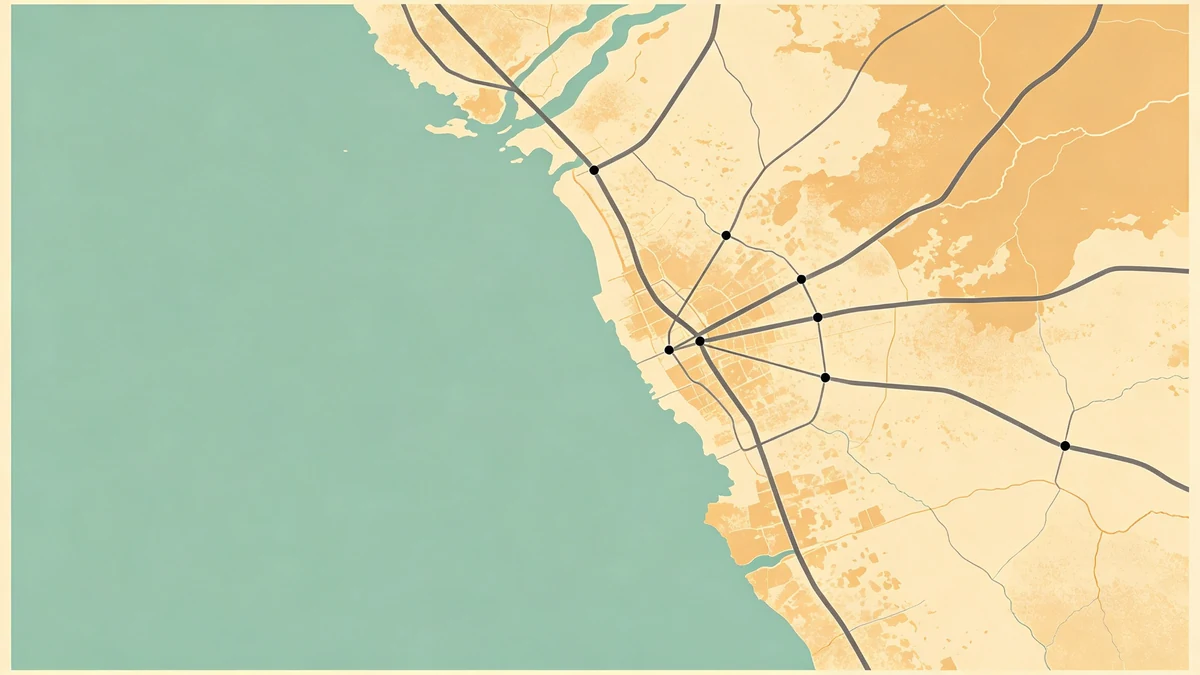
How to Label Cities Without Cluttering Your Map
On posters, labels are expensive. Each one competes with land, water, and your title. This guide keeps type useful inside MAPDRAW.APP.
Hierarchy outside vs inside the map
Often the strongest “label” is the poster title—not street names. Put city/couple/trip names in a quiet margin band; keep on-map labels scarce.
Density rules
- Prefer water bodies and districts over every alley
- Delete overlaps ruthlessly
- If two labels collide, the weaker story loses
Beginners over-label; see illustration tips.
Placement
Sit labels in calm land pockets. Avoid dense grids and busy shorelines (coastal styling). Offset consistently.
Typography
One family; clear size steps; skip outlines that look like stickers. Minimal posters (minimal, dark) need even fewer words.
Pairing with icons
Don’t label and icon the same point unless necessary (icons).
Use-cases
Wedding guest readability (venue maps, multi-stop clarity ([road trip](/blog/road-trip-map-poster-tutorial, [family](/blog/family-travel-map-multi-trip-layout-ideas, travel footprint, gift captions (anniversary.
Finish
Check sofa distance, then export ([export settings](/blog/export-settings-print-ready-map-posters, sizes. Color contrast from [color guide](/blog/how-to-choose-colors-illustrated-maps.
FAQ
All caps city names?
Great for short names; long phrases often read better in title case.
Bilingual labels?
Hero language large; secondary language in a smaller subtitle—not duplicated on every feature.
Leader lines?
Rarely on art posters—they add diagram noise.
Keep exploring on MAPDRAW.APP
Ready to design? Open the map editor, browse templates, or check pricing.